This Classic Tale’s Reimagining Makes One Fatal Mistake
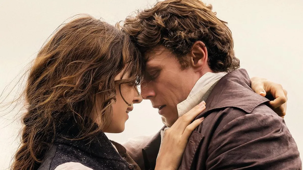
Focus Features Once upon a time, the movies had color.
Fiery yellows.
Ruby reds.
Sunburnt oranges.
Bruised purples.
And lush greens and radiant blues that made the grass and sky look even more wondrous than they do in reality.
Those hues—and their myriad variations—imbued projected images with a vitality that enhanced the emotions writ large across the screen.
They were part and parcel of the cinema’s transportive power.
Those days, alas, are apparently gone—or at least far rarer than they should be, thanks to color grading (also perpetrated by Netflix) that often renders films dreary and monotonous.
Such is the unfortunate case with Sense and Sensibility.
A new adaptation of Jane Austin’s 1811 debut novel has handsome staging and production design, a stately score, and fine performances—all of which are offset by a muddy visual palette that turns even the ostensibly brightest day drab.
Dampening the endeavor’s spirit and, with it, the roiling emotions that are its lifeblood, this version’s downcast approach drains it of the spark it demands.
Because Ang Lee and Emma Thompson’s Oscar-winning 1995 Sense and Sensibility remains an excellent take on Austen’s classic, Georgia Oakley’s rendition (Oct.
16 in theaters) can’t help but feel like a relatively unnecessary do-over.
5News aggregated this summary from the outlet’s public feed. The full article, with all the context, is on www.thedailybeast.com — the content belongs to The Daily Beast.