Instagram Unveils ‘More Modern’ New Logo, and People Are Already Making Fun of It
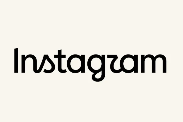
Meta’s Instagram proudly launched a new logo Thursday — its first update in a decade — and the trolling has already begun.
“The wordmark at the top of the app hasn’t changed in 10 years, so it was time for a refresh,” Instagram head Adam Mosseri wrote in a post on the platform. “Cleaner and more modern, with references to the original and the simplicity and craft that’s always made it Instagram.”
Instagram fans immediately latched on to the fact that the stylized “r” in the new logo could be easily confused with another letter, like “z” or “u.” Popular on Variety
“Is it just me or It reads : instagzam ❓,” one commenter said in reply to Mosseri’s big reveal. Another user commented, “Instagwam – how a toddler would pronounce it. Perfect.”
Someone else quipped: “Instaguam! Nice to see the US territory finally getting its due.”
The multihued Instagram icon, an abstract representation of a camera, isn’t changing. For the record, here is what the previous, cursive-y looking Instagram wordmark looks like:
5News aggregated this summary from the outlet’s public feed. The full article, with all the context, is on variety.com — the content belongs to Variety.