Fifty shades of … what? The absurd quest to name colours
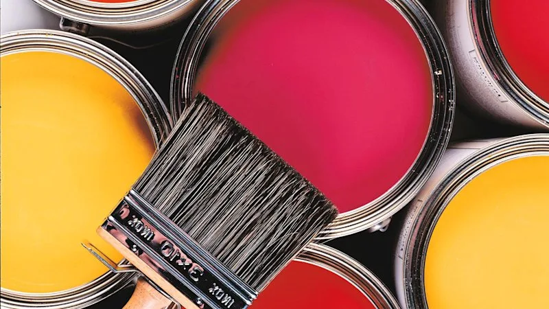
Wander down the paint aisle of any hardware store, and you’ll drown in pastels, from Fair Bianca to Eggshell via Napkin. See the problem? Back in the day, white was white. But not now. Today one painter’s Vanilla is another’s Rice Cake. Today we deal in glosses and mattes, where Dulux’s Little Lamb is Taubmans’ Albatross. It’s madness on a maulstick.
Even back in 1755, Doctor Johnson waves the white flag. Within his pioneering dictionary, Johnson defined pink as “a colour used by painters”. While blue was “one of the seven original colours”, akin to explaining an apple as an enduring snack. Enter Kory Stamper, a US lexicographer who likens colour-defining as the collision of two forces: “the democratic chaos of language and the curated precision of science”.
True Color (Knopf, 2026) is Stamper’s bid to map this collision. Her subtitle spells it out: “ The Strange and Spectacular Quest to Define Colour – from Azure to Zinc Pink ”. The book’s focus is the Merriam-Webster Third Edition of 1961, the same anvil-sized Scrabble bible my grandma bequeathed me.
Gone was the luxury of green, say, being equated to a meadow. Far too facile for 1961. This was postwar America after all, the midst of the science age, where the new world welcomed the polio vaccine and fax machine. Colour boffins were recruited to lend the lexicon a vital precision, a market edge. Yet, the rainbow sputtered for years. Physicist Irwin Priest quit before he started, handing the prism to Isaac Godlove, a chemical engineer, who strove to distil colours with words.
Not always with lay readers in mind, it must be said. In 1954, Godlove’s opaque definition for blue was “the portion of the colour spectrum lying between green and violet (reddish blue). More specif., any of the colours normally seen when the portion of the physical spectrum of wavelengths 465 to 482 millimicrons is used as a stimulus.” Are we clear?
Albert Munsell, a Boston painter, tackled the equivalent pickle in the 1930s, devising a colour cylinder of graded nuances. Picture a watermelon wedge of rainbow hues, from bold rind to pallid core. Godlove – and later his intuitive widow Margaret – converted the cylinder to a Cartesian plane of lightness (value) against chroma (saturation) as a way to pinpoint definitions. A noble effort, but what punter would grasp a “dark weak orange” as brown? Or “light grayish red” as lilac? If anything bridged the chasm between language and science, it was industry. Firms such as Pantone and Dupont demanded standards for dyeing, and patents, just as New York cabs owned their unique yellow and Cadbury its purple.
Margaret Godlove, herself a colour scientist, became the problem’s golden girl. Her lyrical touch, plus a diet of fashion catalogues – with winterberry cardigans and copperglaze lippie – blended spectrometry and poetry as seen in her exquisite buttercup: “a variable colour averaging a vivid yellow that is redder and deeper than dandelion or goldenrod”. The publisher was tickled pink in that “pale red to moderate reddish purple colour way”.
Far handier than Dr Johnson’s jaded shrug. Or Pantone’s 219C (for Barbie Pink).
5News aggregated this summary from the outlet’s public feed. The full article, with all the context, is on www.brisbanetimes.com.au — the content belongs to Brisbane Times.